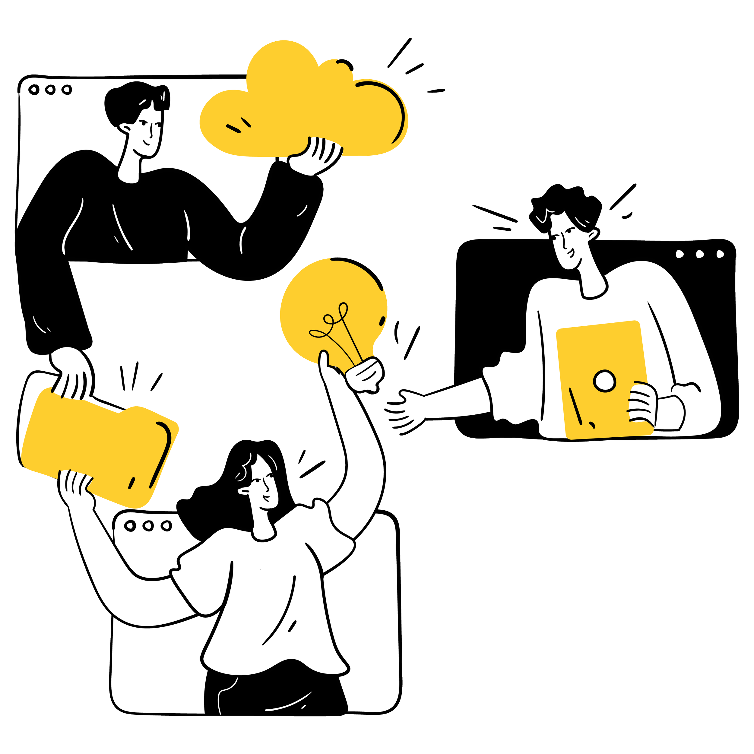
Educate and empower employees to meet retirement goals
Role: Lead UX Designer
Project Type: Web Application Prototype
Tools Used: Figma, Sketch, Jira, Abstract
Team: Design, development, business/product
For public sector employees, retirement planning can be complicated. Without a way to connect their accounts to external sites and plain language, it’s hard to see a complete picture of their retirement savings and benefits.
I led the design of a prototype to change that: a welcoming, educational platform that pulled everything into one holistic view. It helped users see all their benefits, educational components, and tools to set and track retirement goals.
The goal wasn’t just to simplify. We aimed to empower employees to make confident, informed decisions about their financial future.
Due to the sensitive nature of this project, I've used generalized language and scrubbed wireframes of identifying information.

The role I played
Advocated for alignment across product, development, data, and stakeholder teams through daily design collaboration sessions, ensuring everyone worked toward a shared vision
—
Brought the product vision to life by collaborating with the product team and stakeholders to design user-centered solutions that balanced requirements, feasibility, and impact
—
Built an inclusive, accessible, and scalable design foundation with end-to-end user flows, wireframes, and a comprehensive design system spanning the entire roadmap
—
Conducted a full site audit to identify design inconsistencies and offered recommendations to resolve functional and UI bugs

The difference I made
My team and I delivered:
A scalable, accessible design system with reusable components and developer-ready specs
End-to-end flows and wireframes across all roadmap phases
A comprehensive design audit documenting functional gaps and visual inconsistencies
Although the project didn’t launch due to funding constraints, we left behind a strong foundation. The research, components, and designs were complete and ready to go for the next team to carry forward.
And most importantly, our work resonated. Through user research, we discovered that potential users were genuinely excited about our product vision, one that offers a fresh, empowering approach to their retirement journey.

The solution
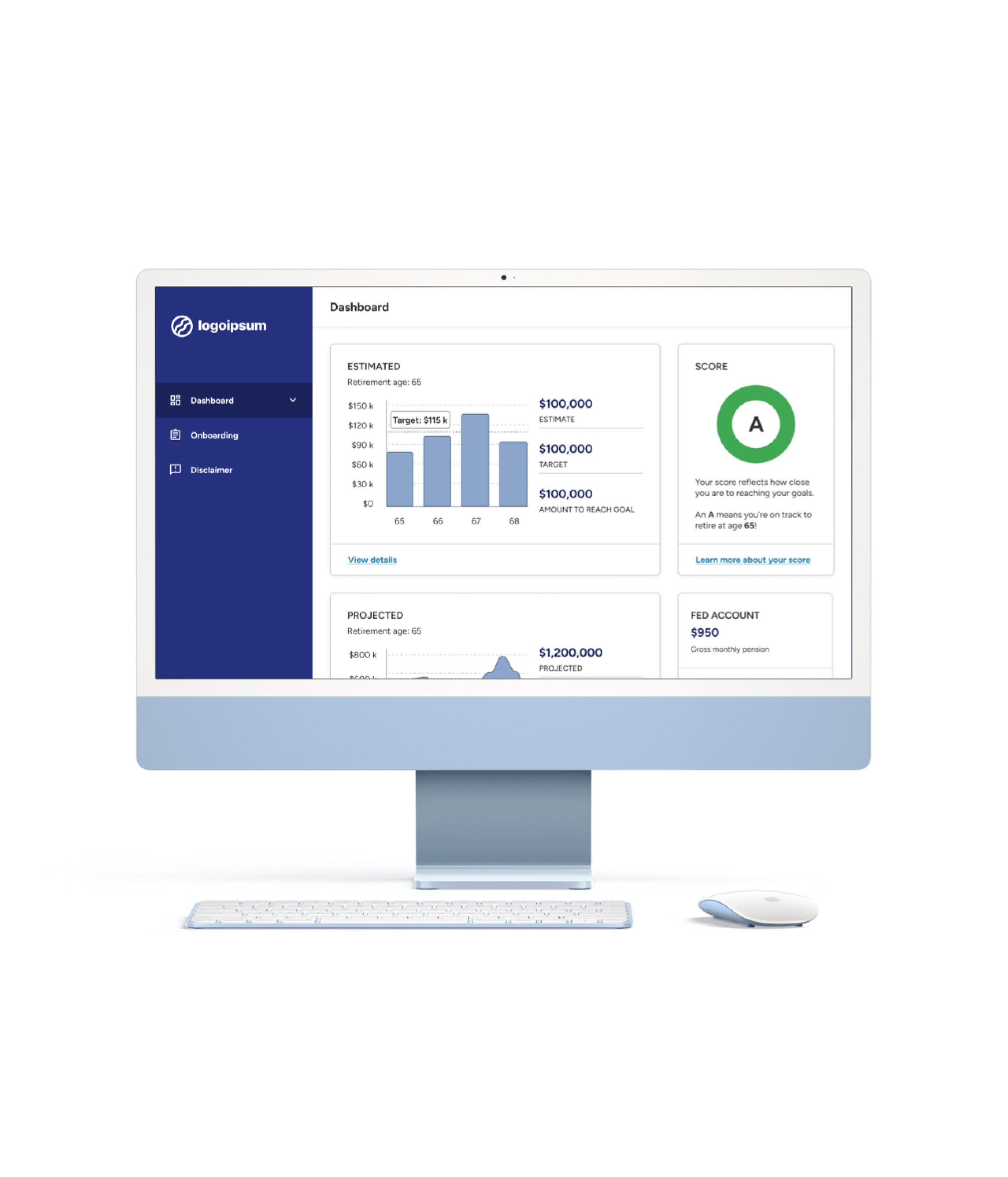
The dashboard
Onboarding
Retirement outlook

If you have time and are curious about the design process, keep reading.
Or if you’re viewing this on a desktop, use the navigation on the left to jump to any section that interests you.
The background
Ah, retirement. The day most people dream about after years of clocking in to their 9-5. More time to spend with loved ones, pick up new and old hobbies, maybe even travel the world. But that kind of freedom doesn’t just happen – it takes planning. And to be honest, it can be a little bit stressful. And for public sector employees? Even more so.
Before I joined the project, another design team had done discovery work to find out what retirement planning was really like for public sector workers. This is what they found:
Accounts were scattered across public sector and commercial platforms.
Financial jargon required a lot of Googling or an advisor to interpret.
Outdated public sector retirement systems and complex procedures made it harder to understand benefits or plan for the future.
And because those accounts couldn’t connect to external sites, employees had to do the grunt work of piecing it all together.
I joined the project after a 6 month pause. My team was tasked with delivering a working prototype, and we had just 3 months to deliver 4 major phases:
Onboarding
Dashboards
Data visualizations
Future scenario builders
I met with the original design team to quickly get up to speed on their research, market analysis, design decisions, and stakeholder expectations.
To guide our solution, we asked ourselves:
How might we…
build an educational platform that helps people feel ready for retirement and welcomes, rather than overwhelms, them?

Understanding the users
Our first task was to build an onboarding flow. We quickly realized that retirement planning couldn’t be captured in a one size fits all experience. The audience was far too diverse to fit into one or two neat little UX persona boxes. Their needs varied dramatically depending on:
Employment type
Career stage
Interest in retirement planning
Comfort in technology
To represent the range of users we needed to support, my team and I mapped out 6 archetypes:
The Early Career Employee
Comfortable with technology but not focused on retirement planning at this point in their career
The Nearing-Retirement Employee
Comfortable with technology and very engaged with retirement planning
The Interested Employee
Comfortable with technology and curious but overwhelmed with retirement terminology
The Retiree
Eager to track accounts but potentially struggling with technology
The Former Employee
Former public sector employees managing accounts across both sectors
The Multi-Account Holder
Balancing both civilian and military retirement accounts and needs a single view
These archetypes constantly reminded us who we were designing for. Every design decision had to make sense for them.
When requirements changed (as they often do), we asked ourselves: are we designing for them, or are we designing for ourselves? Evaluating each idea through their lens kept us focused on supporting real user needs, not just hypothetical ones.
The design principles
Before we built anything, I set a few guiding principles for the design system:
Approachable language that feels warm and human
Visuals that invite people in, not add to their stress
Welcoming and friendly
Approachable without losing credibility
Clear data, plain language, and transparent calculations were essential
Trustworthy
Simple but engaging
Digestible, easy-to-understand copy
Clean visuals that kept accessibility at the heart
My goal was to create an experience that built trust and made retirement planning feel less intimidating.
Snippets of the design system
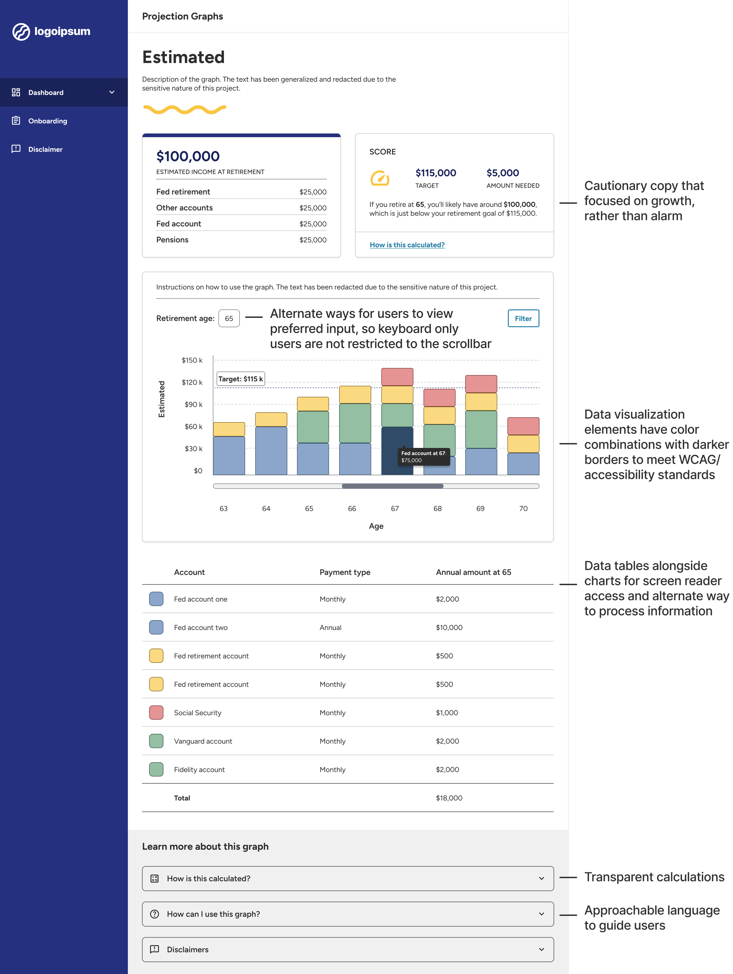
Note: The platform hosting this site limits the length of alt text. Since the image above contains a large amount of text, the complete alternate text is provided below:
An image of a wireframe. The wireframe includes a header, data cards of user info, a stacked bar chart with a hover selection, a data chart, a learn more section, and main navigation. It also includes text describing the design system. The text includes:
“Cautionary copy that focused on growth, rather than alarm”
“Alternate ways for users to view preferred input, so keyboard only users are not restricted to the scrollbar”
“Data visualization elements have color combinations with darker borders to meet WCAG/accessibility standards”
“Data tables alongside charts for screen reader access and alternate way to process information”
“Transparent calculations”
“Approachable language to guide users”

Building the experience
I validated user flows and wireframes daily through collaborative design sessions. With a tight schedule and a small development team, everyone was doing their best to keep up.
We had to navigate some challenges:
New use cases and requirements surfaced constantly, as we worked to serve a diverse audience. This helped us refine the experience, but it also meant stakeholder feedback shifted frequently and rework for both design and development.
When preferences leaned away from user-centered solutions, I created multiple variations of the same screens and walked the team through my reasoning.
Technical limitations meant we couldn’t connect to certain systems for our MVP, requiring users to manually enter their data and adding friction to the onboarding experience.
How I helped the team stay on track:
Even with fast-moving priorities, my team and I stayed adaptable. We made rapid updates while grounding our decisions through design theory, usability, and accessibility principles.
I also suggested additional features, like including data tables with graphs to improve accessibility, many of which made it into the final design.
The core features we designed:
Onboarding
Captured goals, career details, and account information to personalize the experience
Dashboard
Summarized readiness scores and projections, so users could see their overall progress
Data visualizations
Projections graphs of retirement outlook, combined with charts to make financial data accessible to all users, including those using screen readers
Scenario builders
Let users explore “what if” questions and see how those could shape their retirement outlook
Validating our work
The feedback confirmed that we were on the right path:
Users were excited about a tool that didn’t exist in the public sector space.
They liked the simplicity, clarity, and feel of the UI.
They were excited about our solution’s potential.
We also heard a few constructive notes:
Some users felt the onboarding flow was too long.
A few found some steps were unclear.
—
Because technical limitations and business requirements limited how much we could shorten onboarding, I reorganized key screens and added clarifying labels to make the process smoother and more intuitive.
Public sector user testing policies came with limitations, so we got creative. We recruited within our networks, including internal employees who were former public sector workers. We built an interactive prototype and ran one-on-one sessions to observe how people navigated the platform.
Key quotes
“I like how it’s very simple and straight to the point and gives me opportunities to learn more and see this info in a non-scary way, besides the [retirement readiness] score.”
“I like seeing the picture of how much you’re earning per year – gives me comfort of how I’m doing and gives me more motivation to try to get there.”
“I want to go in and use this right now. I think it would help me in terms of my planning. I don’t know where I am in my goals - I guess I need to set my goals first. I think we would be excited to use this.”
The difference it made
Although the project didn’t launch due to funding constraints, we left behind a strong foundation. The research, components, and designs were complete and ready to go for the next team to carry forward.
And most importantly, our work resonated. Through user research, we discovered that potential users were genuinely excited about our product vision, one that offers a fresh, empowering approach to their retirement journey.
My team and I delivered:
A scalable, accessible design system with reusable components and developer-ready specs
End-to-end flows and wireframes across all roadmap phases
A comprehensive design audit documenting functional gaps and visual inconsistencies
The lessons I learned
Integrated teams > silos
Timelines, budget, and staffing were tight, so leadership prioritized development over design. We made quick progress, but the gains didn’t last. I had seen on past projects that when designers and developers work closely, products are more consistent and stable, and bugs and tech debt stay low.
When I led a full design audit, I saw how many issues could have been prevented with earlier collaboration, and by that point, many UI and functional issues needed major fixes.
If I could start this project over, I’d advocate for a stronger design-development pipeline from day one.
Foundational work is worth the time
We used Abstract to quickly generate dev specs, but it wasn’t always rendered accurately. Even with tight timelines, I’d prioritize building a reliable design guide early and validating front-end implementation throughout development.
User feedback has an impact
Business requirements often outweighed usability, especially in the onboarding flow. But tangible user feedback helped us make the case for more intuitive solutions. Those insights helped us simplify the experience and ultimately earned stakeholder support.