

Creating safe spaces for the LGBTQ+ community
Role: UX Designer
Project Type: Mobile Application Prototype
Tools Used: Figma, Sketch, Invision
Timeline: Original (March-May 2019, Revisited (February-March 2025)
Finding spaces where we feel safe to be our most authentic selves shouldn’t be that hard. But for many LGBTQ+ folks, it is.
In 2019, I took a UX course and explored this problem. I talked to members of the community, learned they had different needs than I assumed, and designed a mobile app shaped by their voices, one where people could search, browse, and review LGBTQ+ inclusive spaces all in one spot.
Fast forward to 2025. I’ve spent 6 years as a UX designer and grown personally too. Meanwhile, technology has also advanced, and people are more connected than ever before.
So I revisited and refined the concept and added community features. The goal wasn’t just to help people find safe spaces. It was to help them connect with each other and build them together.

Highlights
What I did in 2019: First concept in UX course
Defined initial problem statement focused on safety and accessibility
—
Led user research to understand how LGBTQ+ communities find inclusive spaces
—
Synthesized insights from interviews and competitive analysis
—
Designed user flows, low fidelity wireframes, and a mobile app prototype


What I did in 2025: Revisit and redesign
Reframed the problem around belonging, trust, and community connection
—
Improved accessibility to meet modern standards and WCAG compliance
—
Built cohesive and intentional visual identity to feel more intentional and mature
—
Expanded features beyond search to include community events and follow functionality
—
Refined information architecture and content hierarchy for clearer navigation
The solution
The search flow
Landing
Map results
Organization page
Map results
Expanded community features
Explore Collections
Explore Categories
Bulletin board

If you have time and are curious about the design process, keep reading.
Or if you’re viewing this on a desktop, use the navigation on the left to jump to any section that interests you.

The background
I’ve always had shoulder-length hair, but in 2019, I decided I wanted to cut it all off and get a fade. You might be thinking: “So what? Everyone gets haircuts.” But this wasn’t just any haircut. It was about exploring my gender. The hairstylist told me, “Don’t worry, I cut it more feminine for you.” That wasn’t what I wanted, but I didn’t feel comfortable sharing that I wanted a more masculine cut.
After that, I researched inclusive barbers. Some were more inclusive than others. Eventually, through a social media recommendation, I found one who felt safe. Now I go to a barber who listens, creates a sense of safety, and gets excited when I try new things.
Most people search reviews for quality. For me, it was about safety, comfort, and finding someone who understood my needs as an LGBTQ+ person of color. This wasn’t the first time I’ve done this. It shows up pretty often in my life, especially in healthcare, community spaces, and daily routines.
This made me wonder:
Are other LGBTQ+ folks going through the same thing? Are they also endlessly googling, opening too many tabs of Reddit threads, and asking social media groups to find someone who gets it and who’ll listen to them? Would they even know where to start? And do tools like Google Maps or Yelp give them the information they need?
These questions shaped my research topic and hypothesis for my General Assembly course in 2019.
Initial problem statement
"Members of the LGBTQ+ community aren't aware of available resources and safe and inclusive spaces.”
Getting to the root of it
To keep me grounded, I put together some research goals:
3
Gather perspectives from diverse geographic settings (urban, suburban, rural)
4
Analyze existing market solutions
2
Identify which business types prompted the most safety concerns
1
Understand motivations for researching LGBTQ+ friendly establishments
And through in-depth user interviews, I found out:
Research was exhausting and often inconclusive. There weren’t clear indicators if a place was truly inclusive, and the effort required was discouraging.
Personal services mattered most. Users didn’t extensively search for LGBTQ+ friendly restaurants or other similar establishments, but they did deep research for businesses that affected them personally, such as healthcare providers.
Location influenced behavior. People felt more unsafe in rural or conservative areas, either avoiding them altogether or intentionally doing extra research when traveling.
Community support and connection mattered just as much as safety. Users actively researched LGBTQ+ and BIPOC (Black, Indigenous, People of Color)-owned businesses to support their local community.
Key quotes
“The amount of effort it takes to research doesn’t seem worth it.”
“I go about it the other way around - not so much ‘Is this business queer friendly?’ but I want to support queer-owned businesses.”
“If I feel it affects me or someone else I know, I would be doing more research.”
The landscape in 2019
In my own experience, I’ve had a hard time finding answers to what I was looking for. And from talking to others, it sounded like others did too. I wanted to see what was actually out there and how easy (or not) it was to find what they needed.
I looked at Google Maps and Search, Yelp, Human Rights Campaign resources, Pink Spots, and Psychology today.
And what did I learn?
Some information was there, but not always.
Information was spread across platforms, and it took a lot of time and effort to find.
None of the solutions offered a comprehensive, user-friendly experience built with LGBTQ+ users in mind.


I came to understand that while safety mattered, it wasn’t the whole picture. People wanted to feel connected, to support their community, and to find it with ease.
Meet Sidewalks (the initial concept)
I designed a mobile application that would allow users to:
Find LGBTQ+ friendly and LGBTQ+ owned businesses
Connect with healthcare providers knowledgeable about LGBTQ+ specific needs
Discover spaces with explicit inclusivity indicators
The app emphasized ease of search and clear indications of how welcoming each space was to the LGBTQ+ community.

Six years later….
6 years later, things look a little bit different. Society, LGBTQ+ inclusion, technology, and my own skills have changed. So I revisited this project in 2025 with a few questions:
Would an application like Sidewalks still be relevant today?
Has finding safe, inclusive spaces become easier?
Safe spaces can be found outside of physical buildings. They can be virtual, in third spaces, and across different venues. Can users easily find and join these communities?
How have digital communities evolved to supplement physical spaces?
Are healthcare and personal service providers more accessible now?
The landscape in 2025
To answer some of those questions, I had to see what the landscape looked like in 2025. I found new resources like the Everywhere is Queer app, Discord communities, Instagram accounts, and community calendars. While new digital spaces have come about, the gaps still exist.
The Everywhere is Queer app offered similar functionality to my original concept but lacked comprehensive user reviews and community features. Online social platforms enhanced community connections, but many required prior knowledge of which accounts or servers to follow. That creates barriers for folks that are new to an area or just traveling and passing through.


Designing for today
With a better understanding of what was out there, where the gaps still existed, and (to be completely honest) what my 6 years of experience showed me my original designs were missing, I knew what needed to change.
Improve accessibility
—
Original design issues: Prioritized aesthetics over inclusivity, creating barriers for users with disabilities
Improvements made:
WCAG-compliant color contrast ratios
Screen reader compatibility
Descriptive text next to iconography

Stronger information architecture
—
Original design issues: Neutral colors and rainbow elements caused accessibility issues
Improvements made:
Clearer hierarchies
Streamlined navigation
Organized content into intuitive sections
Cohesive visual identity
—
Original design issues: Neutral colors and rainbow elements caused accessibility issues
Improvements made:
A stronger visual identity and a purple color palette to represent lavender’s significance in LGBTQ+ resistance and empowerment movements
Consistent visual language
Welcoming, more mature and modern aesthetic
Expanded community features
—
Original design issues: Centered on a safety-focused search and business directory
Improvements made:
Expanded on community-building features
A community Bulletin Board for events and meetups
Follow functionality for organizations
Event saving capabilities
Direct messaging with group organizers
2019 vs. 2025 versions of the organization page
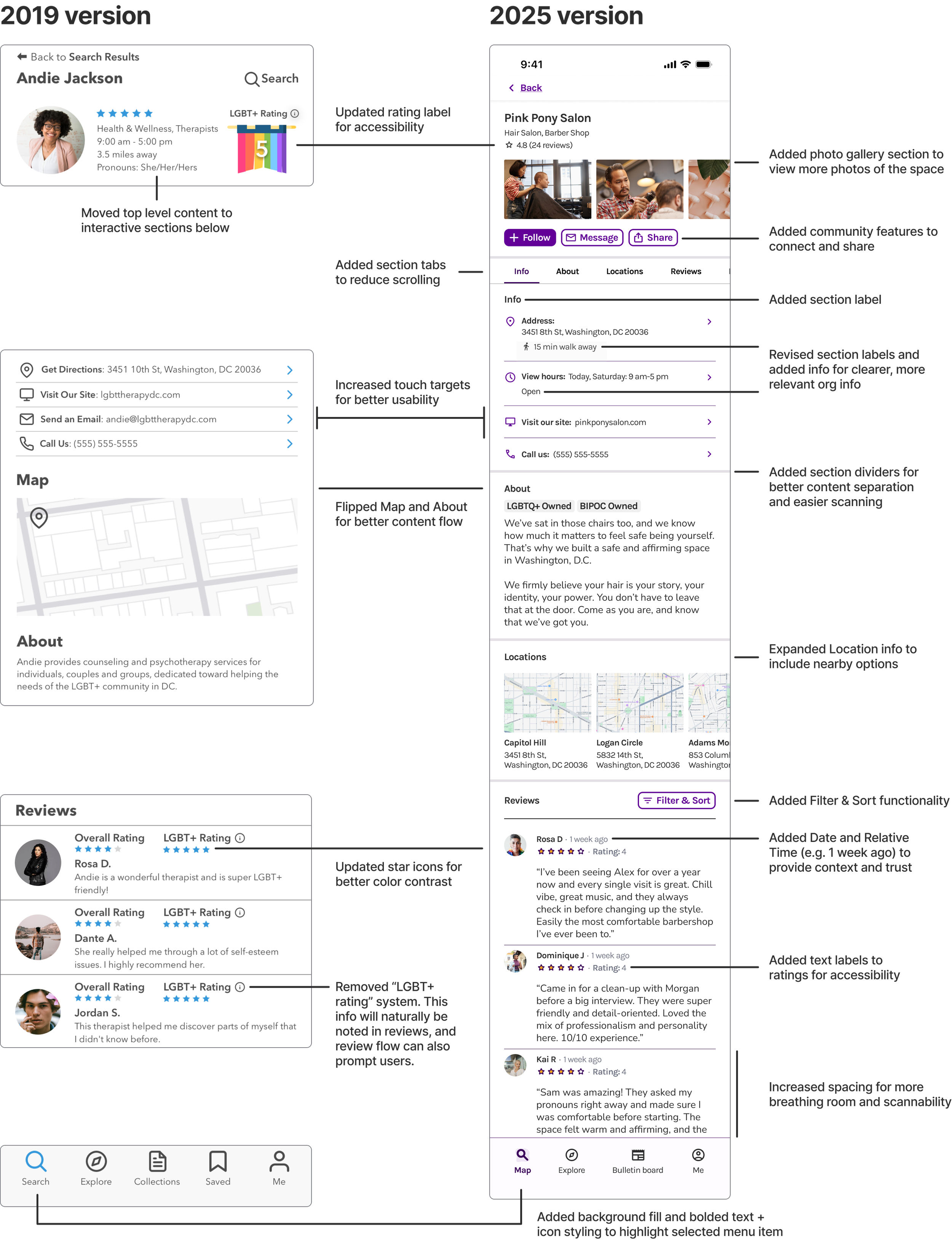
Note: The platform hosting this site limits the length of alt text. Since the image above contains a large amount of text, the complete alternate text is provided below:
An image of two wireframes comparing a 2019 version and a 2025 version of the Organization page. The 2019 version includes Name, Rating, Info, action buttons, Map, About, Reviews, and a main navigation bar. The 2025 version includes Name, Info, Rating, Photos, Follow/Message/Share buttons, navigation tabs, action buttons, About, Locations, Reviews with a Filter & Sort button, and a main navigation bar.
It also includes text describing the updates made. The text includes:
“Updated rating label for accessibility”
“Moved top level content to interactive sections below”
“Added photo gallery section to view more photos of the space”
“Added community features to connect and share”
“Added section tabs to reduce scrolling”
“Added section label”
“Revised section labels and added info for clearer, more relevant org info”
“Increased touch targets for better usability”
“Added section dividers for better content separation and easier scanning”
“Flipped Map and About for better content flow”
“Expanded Location info to include nearby options”
“Added Filter & Sort functionality”
“Added text labels to ratings for accessibility”
“Removed LGBT+ rating system. This info will naturally be noted in reviews, and review flow can also prompt users.”
“Increased spacing for more breathing room and scalability”
“Added background fill and bolded text + icon styling to highlight selected menu item”
What I’ve learned
Listen to more voices, not just mine
When I started this project, the original problem statement and concept was based on my own needs and what I wanted. After talking to people from different parts of the country with different identities, I quickly learned that needs varied greatly. Some prioritized safety. Some needed healthcare providers. And others wanted to support and participate in their local communities.
I carried this lesson into my professional work: intentionally hear from a variety of people and really empathize with what they’re going through. A community isn’t a monolith, and everyone experiences the world in their own way.
Inclusive design means designing for everyone
In 2019, I thought designing for the queer community meant rainbows galore. I wanted people to feel seen, so I leaned heavily into rainbow themes and over-explained everything.
But through 6 years of professional work in inclusive design, I learned it’s not just about visuals and context. Inclusive design also means accessibility. It means keeping things simple and easy to digest. My 2019 version had rainbow colors that were hard to read, overwhelming amounts of information, poor color contrast, and unclear iconography. I was designing for one aspect of identity and missing the many other facets that make us who we are.
The 2025 version fixed many of those gaps, such as building a visual identity centered on accessibility and adding descriptive labels next to icons. And if this were a real project, I’d do usability testing to catch even more.
Sometimes friction protects
You know how some systems ask you to double-confirm before deleting something? That little bit of friction helps prevent accidental errors. And I wonder if the same concept applies here.
This app was designed to increase safety by making information more accessible. But as society has shifted, I can’t help but wonder if friction might actually help. I could see this app being misused to target LGBTQ+ spaces instead of supporting them.
Sometimes keeping information less readily available might actually keep the community safer.
I don’t have the answer to this. But when designing for vulnerable communities, it’s important to think through unintended consequences.
